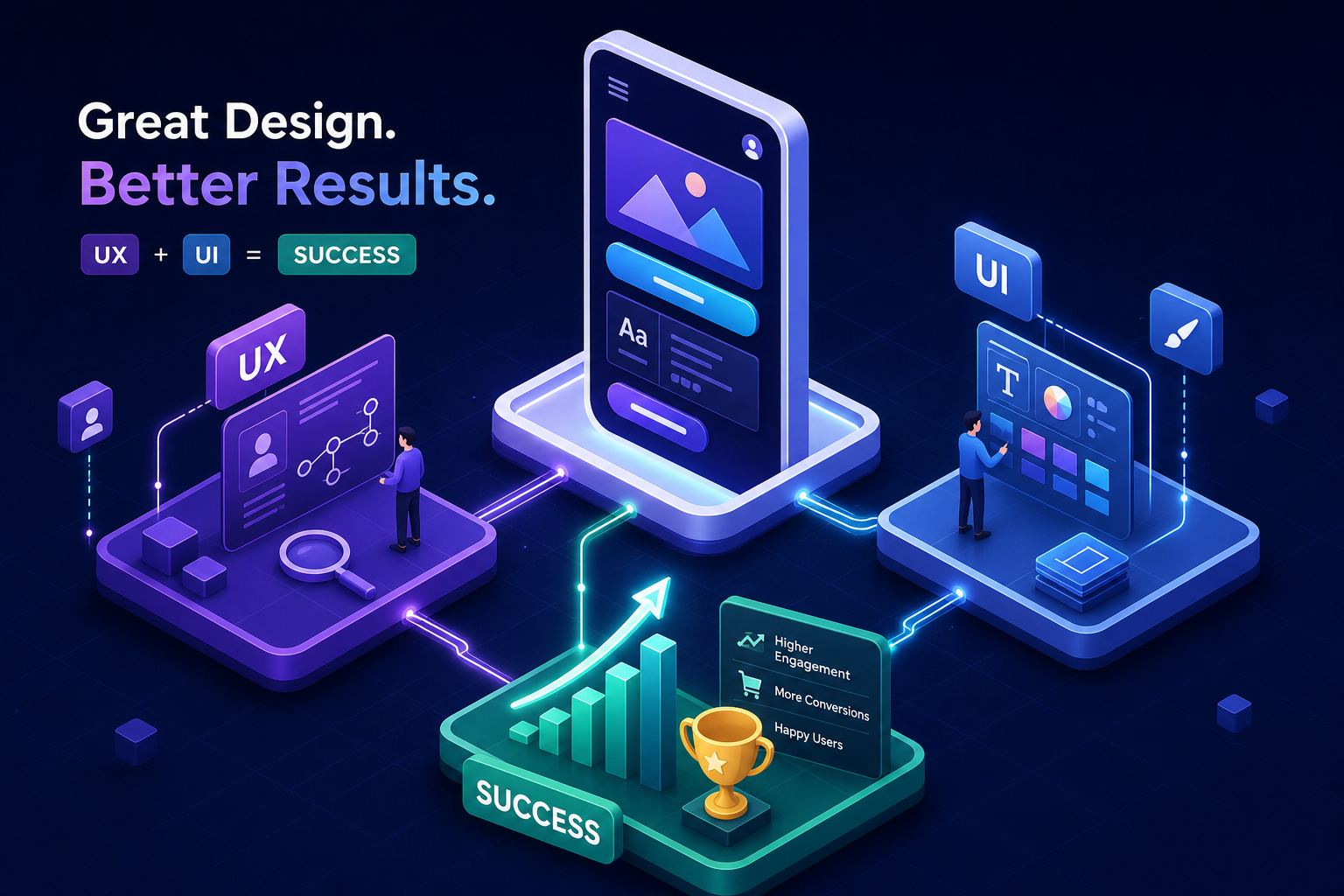
Almost everyone in tech says “UX/UI” like it’s one word. One job title. One thing you hire for or budget for or ask your agency to handle. It isn’t. And that small misunderstanding quietly shapes how products perform, how users behave, and why so many digital products that look finished still feel broken to use.
Many product failures aren’t technical failures. The code works. The app loads. But users drop off mid-flow, skip key features, or simply don’t come back. Those are experience and interface failures, and they commonly trace back to how user experience design and user interface design were understood, sequenced, or integrated from the start.
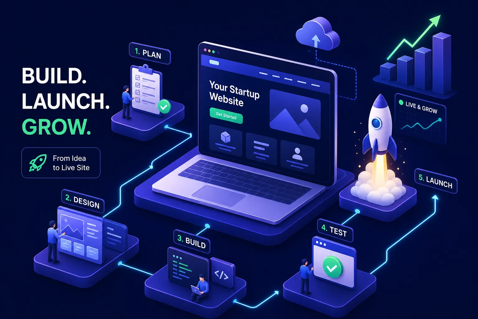
This article lays out what each discipline actually does, where they connect, and why the relationship between them determines whether your product retains users or loses them before they’ve found any real value. Some of the most effective product teams, and the agencies that serve them, treat UX and UI as a single connected system rather than two separate deliverables, and there’s a reason that structure matters more than most founders realize.
UX and UI are not the same discipline
User experience design is concerned with the full journey: how a user moves through a product, what they’re trying to accomplish, and whether the product helps them do it without friction. It’s the invisible structural work done before a single color is chosen or a button is sized. It includes UX research through interviews, usability testing, card sorts, and behavioral observation (see the Interaction Design Foundation’s guide on the difference between UX and UI). It produces the user flows, information architecture, journey maps, and wireframes and prototypes that define how the product works before anyone decides how it looks.
User interface design operates on a different layer. It’s the visual and interactive surface that users actually see and touch: the buttons, typography, spacing, layout, color, and the way interactive states communicate feedback. A UI designer makes decisions about how the interface looks and how interactions feel, all informed by the structural work that experience design already defined. Figma is the dominant tool for this work in 2026, with Sketch still used by many Mac-focused teams for its offline workflows and design system capabilities.
The shorthand to hold onto: UX is about how it works. UI is about how it looks and behaves. One discipline defines the architecture; the other furnishes and finishes it. Both disciplines are doing something the other cannot replace.
What each role actually produces
Understanding deliverables is where the abstract distinction becomes concrete. When you invest in user experience design, you’re funding the research and structural thinking that happens before any visual work begins. That means user research findings, personas, user flows, journey maps, site maps, and low-fidelity wireframes that validate how the product is organized before a pixel is placed. Usability test results and the iterations that follow are also part of this output. These aren’t design artifacts in the polished sense, they’re decisions made visible. For a practical overview of what a UI/UX designer does, a concise guide can help teams align expectations across roles.
When you invest in user interface design, you’re funding the execution of that structure into a real visual product. The deliverables here are high-fidelity screen designs, component libraries, design systems that ensure visual consistency across the entire product, responsive layouts, and state designs covering hover, error, empty, and active conditions. Developer handoff specifications, often through Figma Dev Mode, are the final output that bridges design and build (for a summary of essential skills for UX designers that inform both UX and UI work, see this resource).
A useful way to think about it: UX deliverables answer “does this product make sense?” UI deliverables answer “does this product look credible and feel right to use?” Both questions matter. Skipping either one costs you.
Where products quietly fall apart: the UX/UI disconnect
There are two common failure modes, and both are understandable mistakes that happen when UX and UI are treated as sequential rather than connected work. Recognizing them is the first step to avoiding them.
The first is a polished interface built on top of unvalidated assumptions. The screens look professional. The color palette is considered. But the underlying user flows were never tested with real users, and the information architecture was designed by someone who already understood the product. Users land on something that looks trustworthy but doesn’t help them accomplish their goal. According to a widely cited Sweor industry analysis, 88% of users are less likely to return after a poor experience, and “pretty but confusing” products drive exactly that kind of quiet exit. Users don’t leave angry. They just don’t come back.
The second failure mode runs the other way. Strong UX work, thoughtful flows, real research, but underdeveloped visual execution. The product is functional but fails to build trust. Users make fast judgments about credibility based on interface quality, and inconsistent spacing, unclear hierarchy, or weak typography erode confidence quickly. A widely referenced figure in web design research puts the share of users who won’t return after poor visual design at 94%. Interaction design lives at the intersection of these two: the way an element behaves on click, hover, or transition is where UX intent meets UI execution, and that moment either reinforces trust or breaks it.
How investing in both drives retention and conversion
Retention is fundamentally a user experience problem. Whether users get value quickly and repeatedly depends on how onboarding flows are structured, how features are discovered, and how smoothly tasks can be completed. Industry research on SaaS onboarding suggests that structured onboarding flows can improve first-year retention by roughly 25%, and users who reach core product value in their first session are significantly more likely to renew. Poor UX creates invisible churn: users leave without explaining why because they never felt confident the product understood what they needed.
Conversion is heavily influenced by user interface decisions, but it depends on UX and UI working in coordination. The right call-to-action in the right place with the right visual weight at the right moment is a UI decision, informed by UX structure. Product design tools like Figma make it possible to test visual hierarchy and interaction states before development begins, reducing costly fixes after launch. A well-designed interface communicates that the product is credible, maintained, and worth paying for. Research from the Aberdeen Group found that a 1-second delay in page response causes a 7% drop in conversion. Slow, visually inconsistent interfaces produce a similar effect emotionally: they signal unreliability before a user can articulate why.
A 5% improvement in retention can raise profits by 25% to 95% in SaaS contexts, according to research from Bain & Company. That’s not a design statistic. That’s a business one. And it starts with the experience and interface working together rather than in tension.
The case for a unified, strategy-led design process
The common mistake isn’t hiring the wrong designer. It’s treating UX and UI as sequential handoffs between different people with different briefs and different success criteria. UI designers inherit wireframes they didn’t shape. UX designers lose influence over how their flows are actually rendered. The result is a product that feels disconnected even when each piece looks fine on its own. Users feel this before they can name it (for guidance on how product and UX roles differ and overlap, see the Interaction Design Foundation’s article on the difference between product and UX designer).
An integrated approach means that brand strategy, user experience design, and interface design inform each other from day one rather than running in sequence. Exult Creative Inc. is structured around this model: the same strategic intent flows from the research phase into the wireframes, into the visual design, and into the development spec without losing fidelity at each handoff. For startup founders and product teams, this matters because it reduces the hidden cost of misalignment, fewer contradictory decisions, tighter alignment across disciplines, and a product that behaves the way it was conceived when it goes live.
A siloed process almost always produces compounding problems downstream. The wireframes don’t account for brand tone. The UI doesn’t respect the flow logic. The developer builds to the mockup, not the intent. An integrated process catches those gaps early because the people making those decisions are in the same conversation from the start.
What to do if your product’s design is holding it back
The first question worth asking isn’t “do we need a redesign?” It’s “do we know where users are dropping off and why?” That’s a UX research question before it’s a design question. If the answer is unknown, investing in UI polish before understanding the structural problem is solving the wrong surface faster. Prettier screens on top of a broken flow don’t retain users any better than plain ones did.
If the experience and the interface both need work, the most important thing is finding a partner who treats them as one connected problem rather than two separate line items. A branding and product design agency that starts from strategy, runs research before wireframing and prototyping, and carries a consistent intent through to visual execution is far more likely to produce a coherent product than a disconnected set of handoffs between specialists working in isolation.
UX and UI design, done well together, represent one of the highest-leverage investments a product team can make. They determine whether users stay, convert, trust the product, and recommend it. The question worth sitting with: when you last shipped a feature or redesigned a flow, was it based on what you assumed users needed, or what the research showed they actually did?